Google Photos is getting UI changes following user feedback
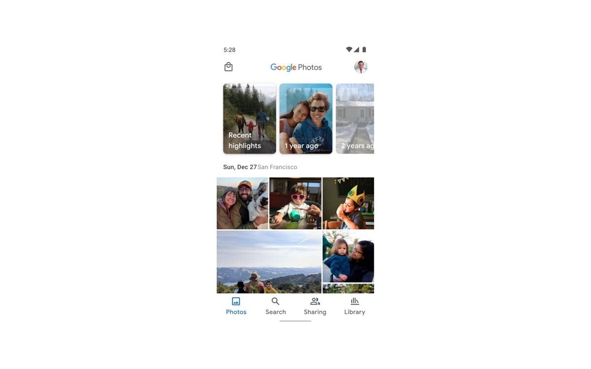
Google has announced it’s rolling out UI changes to Google Photos following user feedback. The search giant said the changes, which are available on Android beginning today, will make it easier to find your shared memories and the print store.
“We are always looking for ways to improve the Google Photos experience by listening to user feedback and comments,” Google said in a support document on Thursday.

Here’s the full list of changes:
- You’ll now see the Sharing tab as part of the bottom navigation bar, bringing your shared photos back to the home screen allowing you to easily view and manage shared content.
- Additionally, the print store is getting a dedicated entry point in the top left of the app header, making it easier to find so you can get your photos off your phone and into your home.
- The Print store will no longer appear in the Library tab, which will still be the home for your Albums, Archive & Trash.
The changes arrive nearly a year after Google rolled out a major overhaul to the Google Photos app. When the redesign hit, Google Photos got a cleaner interface, map view, and several other tweaks. But the Sharing tab was removed from the bottom navigation bar, and instead put behind the Library tab. It was a confusing change, and after feedback, Google seemingly agreed that a change needed to be made.
Since the Google Photos redesign hit, we’ve seen a number of changes hit the service — some good and some bad. On the good side, we’ve seen new adjustment tools and improved search filters. On the bad side, some editing features have been put behind a paywall, while the service’s unlimited free storage option is expiring this month.
In addition to rolling out on Android, the UI changes to Google Photos will be available soon on iOS.
Google Photos (Free, Google Play) →
The post Google Photos is getting UI changes following user feedback appeared first on xda-developers.
from xda-developers https://ift.tt/33k2HUc
via IFTTT
No comments: